
Happy on the Shelf: Styling a Bookcase that Feels like You
A laid-back guide to shelf styling that reflects who you are—dog-eared paperbacks and all.
During my work-from-home days, my carefully styled bookcase was a permanent fixture on every Zoom call (I've never been a camera-off, blurred-background kind of gal). One day, in a shining endorsement of my shelf-styling skills, a senior executive at my company paused the meeting to ask if I'd come arrange hers. Although I never took her up on it, I figure it’s time to write it all down.
So here are a few rules to help create a bookshelf that reflects your interests, tastes, and (do I have to say it?) books you’ve actually read.
RULE NO. 1
Mix upright and stacked books to create visual interest
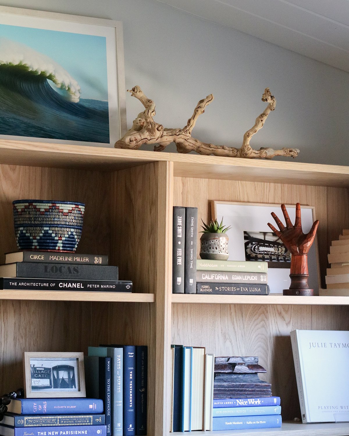
One of the easiest ways to make a shelf look styled instead of just full is to break the horizontal monotony. Stand some books upright, stack others horizontally, and use those stacks as little pedestals for personally meaningful objects. Try a ceramic vessel with a succulent on top of a stack of novels. Or a sculptural wooden hand on a stack of art books (yes, mine’s oddly specific, but you can probably find something equally special at your local thrift store).
The key is to vary the heights. Think of it like a skyline—you want peaks and valleys, not a flat line. On the shelf pictured here, stacks of California by Edan Lepucki, The Stories of Eva Luna by Isabel Allende, and MaddAddam by Margaret Atwood create a natural base layer for a potted succulent, which sits next to an antique wooden hand mannequin (one of my favorite consignment finds).
RULE NO.2
Go ahead, turn your books backward — but do it strategically
This one’s hotly debated, but here me out. Just like alternating between stacked and upright positioning, turning a few books spine-in (showing the pages rather than the spine) can add texture and visual breathing room to your bookshelf.
Here’s my personal caveat, though: I only use this strategy to deal with books that: a) feature aggressively ugly fonts and color choices; or b) books I’ve finished but would rather not publicly endorse. I have a few self-help books from my early twenties that fall into the latter category.
Try it: Pull out 4–6 books with especially clashing or dated spine fonts and turn them pages-out together. The contrast with colorful spines nearby will create a nice little visual rhythm.
RULE NO. 3
Treat objects like punctuation
Your shelf is a story, where books are the sentences and objects are the punctuation. Strategically placed objects create pauses, emphasis, and rhythm—all the things that give the writing on your shelves texture and interest, too.
Use things you’ve picked up on your travels, or gifts that are especially meaningful to you. A few things I’ve incorporated into my bookshelf: a Kukui nut lei from our family trip to Hawaii, a framed black and white photo I took in Greenwich Village when I was seventeen, and a hand-carved maple box my uncle made. Your shelf will work best with a few meaningful pieces rather than a crowd of random objects competing for attention (one exclamation point is better than three, I promise).
RULE NO. 4
Choose a loose palette and group by color
You've probably seen the hyper-color-coordinated shelves on Pinterest where every book is sorted by hue into a perfect rainbow gradient. Amazing! Also, absolutely a complete pain in the rear every time you want to find a title or add a new one to the mix.
A more livable approach is loose color clusters. Blues and greens together, neutrals and creams together, dark greys and blacks anchoring the bottom. You don't have to be too strict about it, just add it to your mental checklist when placing a new book. On my shelf, the black and white spines of White Noise and Middlesex naturally want to group with other dark r neutral spines. The linen covers of coffee table books like The Bold Dry Garden cluster nicely with other white and off-white selections.
And if a spine is truly a disaster? Well, that's what Rule No. 2 is for.
RULE NO. 5
Treat the top of the shelf like the prime real estate it is
The top of a bookcase is a whole extra canvas, where larger-scale pieces like framed art, sculptural objects, and storage baskets can live. My top-shelfers include two tributes to my time in San Francisco: a gorgeous piece of driftwood and a large photograph of the waves at Ocean Beach. This combination brings height to the whole unit gives it a sense of completion—the frosting on the cake, as it were.
Framed photos work particularly well at this height, where they can be seen from across the room without competing with the shelf vignettes below. Layering a framed black-and-white print behind a color photo adds depth and keeps the arrangement from feeling too matchy-matchy.
RULE NO. 6
Read, read, read
As a former English major and high school teacher, I have to shout it from the rooftops: One of the best things you can do for your mind, your soul, and the world at large is to simply read more books. It will make you a better writer and communicator, and it will force you to spend time in someone else’s head for a while (in other words, it builds empathy). But a lesser-known benefit of reading is that it can help you hone your taste and personal style. Many of my design choices are pulled directly from novels—including Countess Ellen Olenska’s minimalist apartment in Edith Wharton’s The Age of Innocence. Read fiction written before the twenty-first century. Spend an hour with a large format photography book. Enjoy the process of learning, and your aesthetic sensibility will improve in the process.
The other benefit of reading, of course, is to lend legitimacy to your beautifully styled bookcase. Read the books. Style the shelf. And only in that order.